The Process
Here is a view into my general process, as well as the sort of story for all my work. I don’t live record my work but here I have breakdowns and general insight to my stuff. Starts off basic but gets pretty detailed further down. Might be interesting might be boring. Take a look.
Basic Behind The Scenes
Here are some layer breakdowns for various projects. I don’t live-record my work, but a little while in I began recording the photoshop document at the end. It doesn’t show the beginning to end process, but it does nicely show how the layers stack and interact with each other. My stuff looks very complex sometimes but the reality is I mostly just use the pen tool and delicate layering with very little photoshop manipulation effects.
#187 Scoob
#066 naM nooM
#019 Flowas Vol.3
#278 Legends
#260 Shimmy, Aminé, directed by Aminé & Jack Begert
#265 Silence in the Library
Photos Used
A big aspect of my more complex work is taking many photos and creating a sort of controlled chaos. I started making contact sheets for complex pieces to show all of the photos that it’s composed of to help break down the confusing nature. Below, you can see the final piece on the left, and all of the photos that were used to make it on the right. Studying pieces and their contact sheets is a good way for me to analyze how I’m using photos and it serves as a sort of reverse manufacturing of something I’ve made.
#018 Flowas Vol.2
#108 Without Me, Eminem, directed by Joseph Kahn
Lightroom
After I finish in photoshop, I finalize it in lightroom. While the edits here only take around 3 minutes, these changes have big visual impact and are responsible for the vintage feel and general cohesive appearance of my pieces. Literally every single piece goes through lightroom, so below I’ve gathered a few of the before & afters. Before on left.
#006 Via PDX
#018 Flowas Vol.2
#226 Smiling Through It All
#200 Fireflies
#247 Spider’s Web
#259 Invincible, by Omar Apollo, directed by STILLZ
Eras & Progression
Surreal From Summer / Starting
#007 Through #016
After an initial inspiration in the pop-surrealist style, I distinctly remember deciding to experiment and find my interoperation of the style. Thus, I grabbed a photo of my friend in a park I had taken that summer, and searched on Pinterest for the images. It was a simple collage, and I greatly enjoyed how it had come out. So, I grabbed another candid picture like it from that summer, and made another. After these pieces went well, I decided to make a series out of it, committing myself to make a total of 10. This was my way in. I saw a few things. One, how simple it was to create in the style. Two, I saw I was pretty damn good at it. Three, this creative process felt better than drawing or painting. It was an art form I had stumbled upon myself, had taught myself, and had found personal success in. It felt good.
#007 Some Surreal From Summer Vol.1
#008 Some Surreal From Summer Vol.2
Flowas / Continued Interest / Pinterest
#017 Through #041
Following Surreal From Summer, entering 2021, I planned on pursuing surrealism and collages further. This is where my Pinterest process really began. I created the “Flowas” series by slowly developing the first piece from two girls at drinking out of the pool, and just kept adding more and more elements inside working my way out. I then added the floral border, which drove the inspiration to make it a series. I still consider the Flowas series to be the best series of works I have ever made, and viewed such random success at such an early point in me experimenting with the medium as a sign to continue. The high number of photos I sorted through for each piece helped me develop the Pinterest boards and photoshop processes that would go on to characterize the coming work over the year.
#017 Flowas Vol.1
Less is More
#042 Through #062
Towards the end of 2021 I began thinking about and acting on reducing the complexity of my work. This took shape in big part through focusing on a central photo to base the collage around, rather than compiling together a large number of elements. The Wish You Could See It and Winter Break portrait series were my manifestations of this. Both involved taking a series of semi-related photos, (respectively for each series,) and making something out of them, rather than combining them in a mixture of other photos where it’s not the center of the work.
#042 I Wish You Could See It Vol.1
#052 Eye For It
#061 Untitled
#063 Through #127
SwellMap Postcard Archive
Entering 2022, I began wanting to expand from my usual Pinterest resource. At the same time, I had watched a Vox video about James Brouwer’s postcard collection. I realized that it would be a good resource of photos to experiment with. It helped emphasize my artistic direction of collaging on to a central photo rather than collaging a bunch of small photos for something bigger and chaotic. The photos have a much more raw vintage feel, as opposed to Pinterest’s “aesthetic” vintage style. Much like Pinterest, this resource turned into an inspiration hub. For either website, if I’m ever without ideas, I can sort through and find a photo to base off of.
James Brouwer Postcard Archive - Linked On Image
Vox Video - Linked On Image
#064 OH THEY BOUT IT
#121 Don’t Look at Me
#122 Wtm
Colors Series & Tapping Into Pop Culture
#074 Through #083
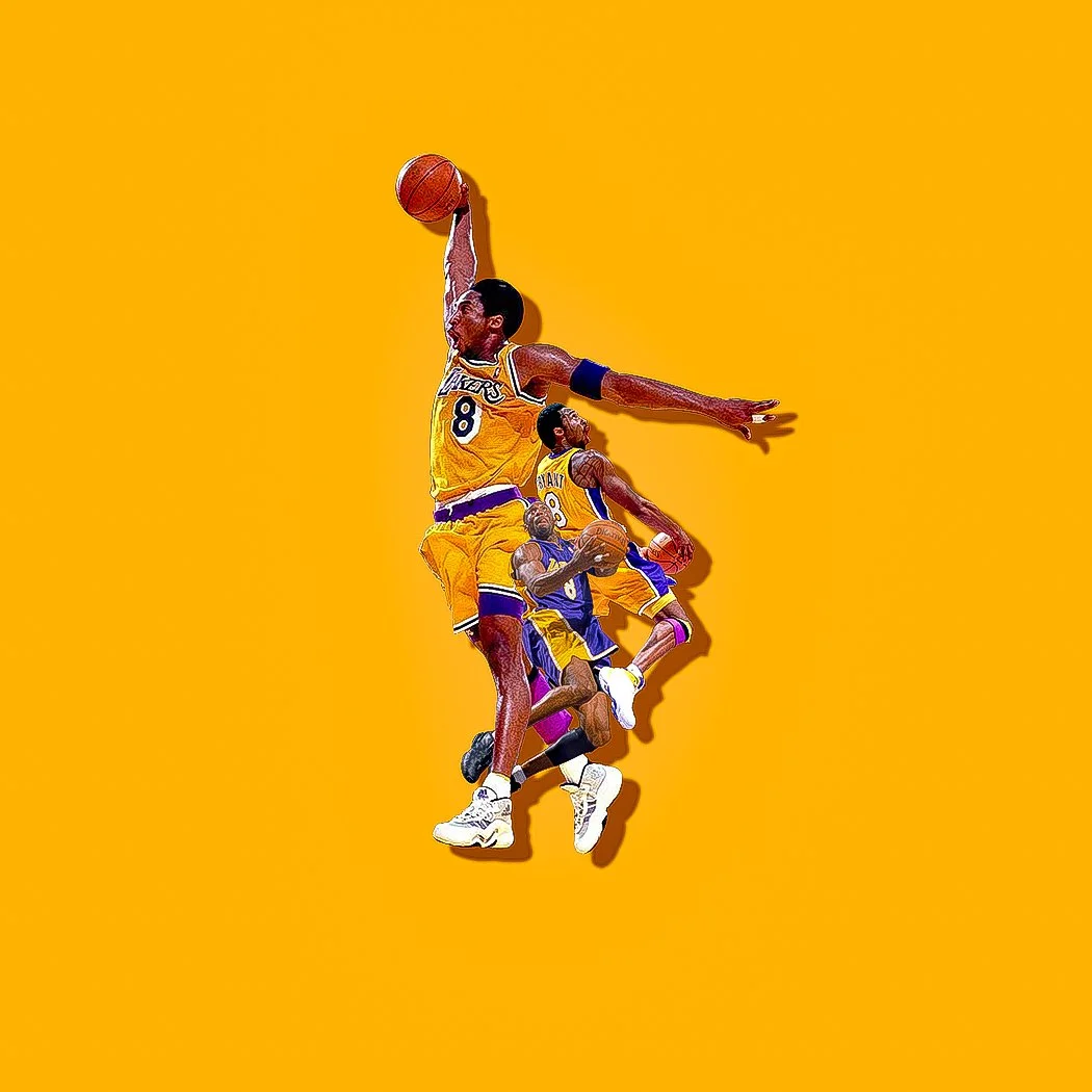
After establishing solidarity with my creative process and comfort with the art style, I had a pretty strong sense of where I wanted to go next. While my style was cool, I knew it didn’t really have natural appeal to an audience outside of those who specifically appreciate collage or surrealism. I didn’t stress this, I just knew it was a matter of changing the subject matter of my art from random people who have been dead for decades to relevant, interesting people. This, combined with my perpetual search for minimalistic work, led me to create the Kobe piece, first of the colors series. Vintage photos of Kobe and MJ are very prominent on Pinterest, so I just decided to start there. I had three pictures of Kobe, not at all knowing what I was going to do with them, and was looking for a fourth, when I just decided to why not keep it to the three photos I had. This led to the close-quarters, precise overlapping style of the colors series. After making the Kobe and Michael pieces, with the series-unique theme of different color variations, it was very freeing and fun to put my own personal interest in pop culture into what photos I chose. This process began connecting myself more to the art, which is a key development. This series also planted the seeds for collaging to create motion, which is one of the most important steps I took, and is detailed further down the page.
#074 Kobe
#084 Through #112 … #175 Through Present
Music Video Collaging
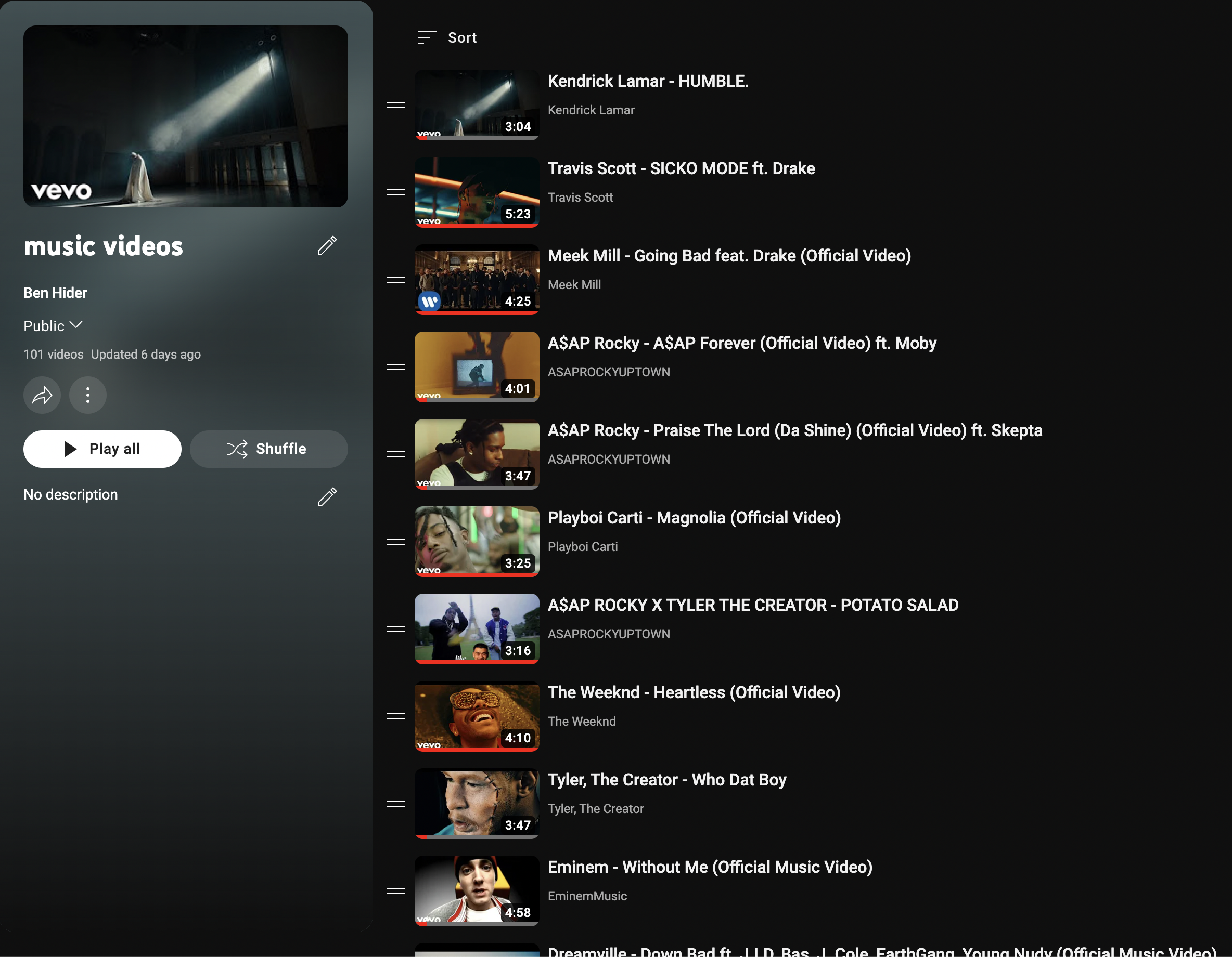
This is a big one. Music videos have always been a big interest to me. I view them as an excuse to create unique visuals that can be free of the narrative clarity that would be needed in a structured, traditional film. While obviously paired with its intended music, the video is fully complete, the visual aspect I described is what appealed to me, and led me to create a playlist a few years ago of music videos that are just nice to look at. The intention was to have an ongoing stream of videos that I could play in the background while I make art. It began with the obvious, more mainstream iconic videos, like “Humble” and “Sicko Mode,” but I began viewing my music video interest as a genuine hobby, and was watching them like someone would television. I expanded the playlist to something I would constantly be adding to, and it had the added benefit of introducing me to music in a very natural way.
This growing interest coincided with two things. The first, was my now prominent art practices, and second, the desire to push my works to a bigger audience and make them more relevant to broader culture. Continuing from my previous series of pop culture figures, it was obvious that people would have more interest in seeing art of their favorite musicians or athletes than some random person from the 1950’s. I decided to just combine my art interest with the music video interest, and make a collage of a music video. I casually experimented a few times with the Humble music video, and realized this could certainly be a new route to take. As a genuine fan of the videos themselves, these pieces also served as a satisfying visual summary of the video’s style, color scheme, and tone, which is something I went on to actively consider as I made them. I made a series of 10, and viewed it as its own thing, a singular series. It wasn’t until a while later, when I was at a point of low inspiration, I thought why not make another music video piece, which I did with Kendrick’s new video for n95. This implemented the music video collaging as a source of content equal to Pinterest or the photo archive and made me look at my comfortability and skill in the art style in a different light. I felt like Thanos adding stones to my gauntlet of series, I was becoming able to make different sub genres within the style that were all still recognizable and cohesive as my work.
My Large Music Video Playlist That Has A Large Influence On Me - Linked On Image
#084 HUMBLE. Kendrick Lamar, directed by Dave Meyers & the little homies
#095 Franchise, Travis Scott, directed by Travis Scott
Music Video Bonus: Collaging To Create Motion
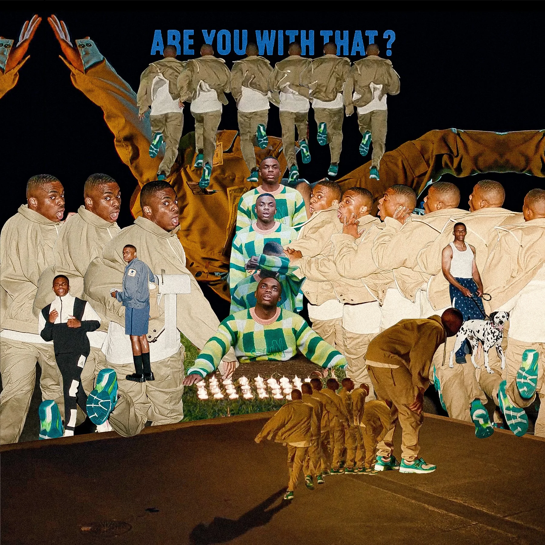
Coming off of the second piece in the original music video collage series, Compensating(1), and working on the third, Arya(2), there was a distinct moment when I did something I was very fond of. The nature of the Compensating(1) video implies motion, but I didn’t think of it as that. I viewed that collage as a cool way to take advantage of the static camera and dance moves. Then, when I was making the Arya(2) piece, and was trying to figure out how to include the cool clip of Kid Cudi leaning back, I developed the repeated cutout in a stop-motion fashion that you can see on the bottom(2). It was one of the few deeply impactful switches in my mind when it comes to seeing my art in a new light. Two music video pieces later, on Doja(3), I remember specifically calling back to the Arya(2) piece, and deciding to implement that effect again, for the swing pushing clip. After that turned out good, I immediately used it again on the Are You With That(4) collage. This particular music video is entirely focused around Vince Staples running(4), so I decided to use the motion style as a central theme of it.
#086 Arya, Nigo & A$AP Rocky, directed by AWGE (2)
#103 Doja, $not, directed by AWGE (3)
#104 Are You With That?, by Vince Staples, directed by Jack Begert (4)
#272 Who Dat Boy, Tyler The Creator, directed by Wolf Haley (6)
#173 n95, Kendrick Lamar, directed by Dave Free & Kendrick Lamar (5)
#085 Compensating, Aminé, directed by Jack Begert & Aminé (1)
From then on, I had acquired it as another surrealist collage tool in my arsenal. I included the six pieces because they show the uniform progression of my experimentation with the effect. From planting the seeds with Compensating(1), to formally introducing myself to it with Arya(2), to intentionally using it as a tool in Doja(3), to using it as the main theme of Are You With That(4), to a reformed, casual element of the n95 piece(5), seen in the car flipping, and using it as a central theme again in the Who Dat Boy video(6), specifically utilizing it to capture the chaotic nature of the video.
TFL
#152 Through Present
The biggest transition in my process began towards the end of my senior year. While I was very satisfied with what I was doing, after enough time, an aspect of it began to become questionable for me. I felt like my art depended on other people’s photography that I stumble on or discovered. It made me feel like the process wasn’t 100% mine, which, wasn’t essential, but at this point in my exploration, it’s something that I wanted to get down. So, I grabbed an empty sketchbook, and began drawing ideas for purely original pieces. In the past with sketchbooks, I always thought too much about what I was making, trying to fill the page, and it bottled the creativity. However, with this book, which I named TFL, short for The Fucking Lab, I relaxed myself to just getting the ideas down, knowing I would make it for real in a different medium with my own photography and photoshop. I knew this was the right step to take because the ideas were flowing nonstop.
The initial projects were certainly geared towards fashion, as this is when I really began wanting to think about ways to apply my work to appeal to industries, in this case, fashion photography. But overall, TFL was my way into making work fully from scratch, and being involved in 100% of the process, notably with entirely preconceived, planned ideas, which opposes the randomness of my previous process. This allowed for more personal input, thus they all feel cohesive to some degree as opposed to the rest of my work. This provided a very natural evolution of my work stylistically, and as my first major change in style/method, gave me insight on how that process is not only possible, but very plausible with the right direction.
#152 TFL Vol.1 Bloom
#218 TFL Vol.7 Syracuse
TFL Book Front Cover
TFL Book Back Cover
#224 TFL Vol. 8 Make Room


